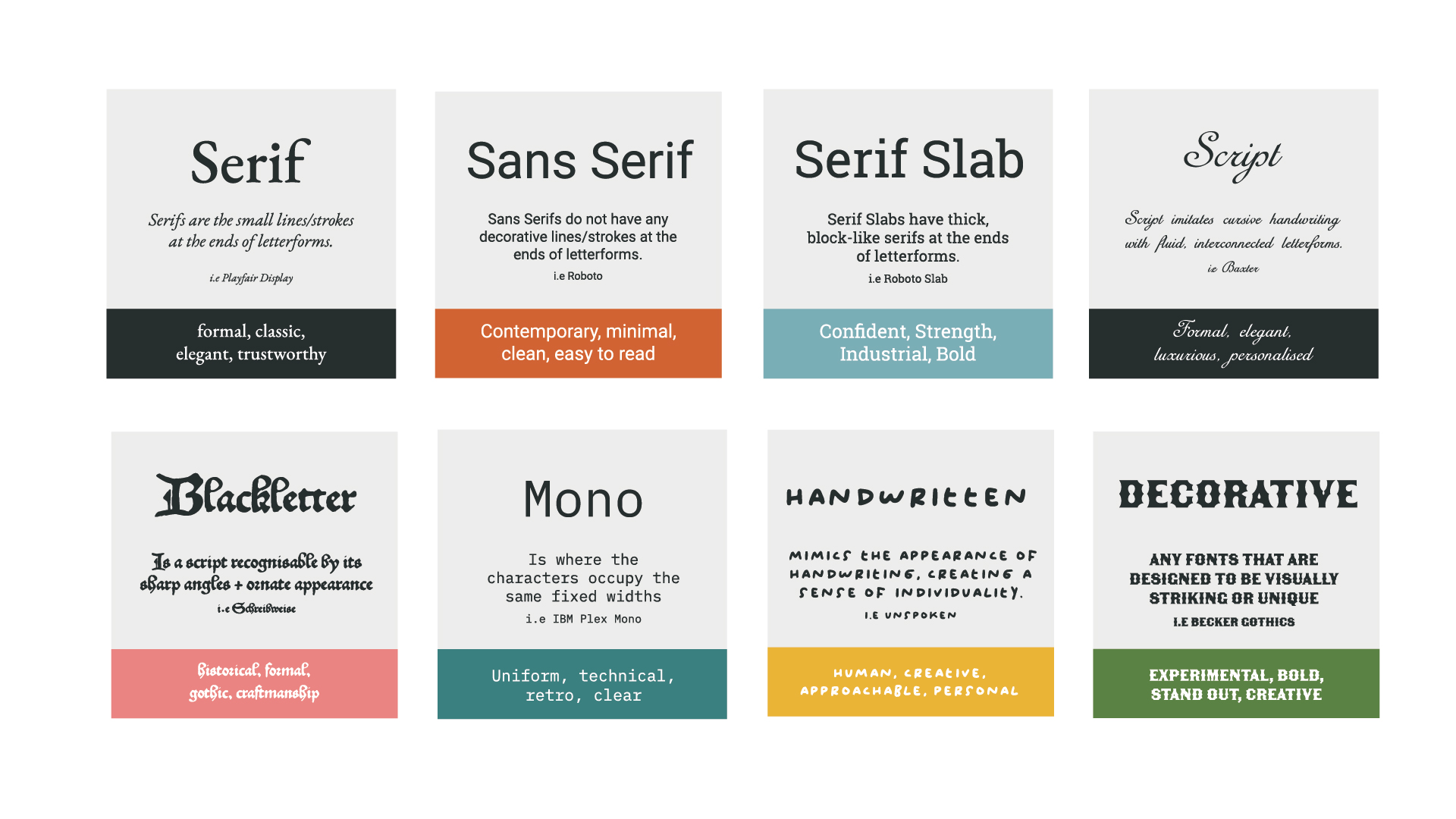
Zoe
She / her; green / blue. Zoe is a designer, daydreamer and self-anointed snack queen. Once described as “so awkward she’s charming” by a friend, there isn’t a day that goes by without her accidentally slipping in an innuendo. In winter, she hibernates in a blanket of books and netflix, but by late spring emerges with her trusty birkenstocks, ready to go on photography adventures and socialise with the neighbourhood cats. If she were a pokemon she would without a doubt be Pikachu, but a buzzfeed quiz has determined her to be a Magikarp. She’s a firm believer that buzzfeed quizzes cannot be trusted, under any circumstances.
Articles by Zoe
Projects by Zoe
Video production - BARNSLEY PREMIERE LEISURE
A heartfelt brand video for BPL Swim School, showing how local children grow in confidence through supportive, community-led swimming lessons. Through authentic storytelling and uplifting visuals, the campaign highlights the emotional journey from first-day nerves to joyful progress—reinforcing BPL’s role as a trusted, family-focused organisation making a real impact in children’s lives.
Branding - Comsim x sinsou
We worked with Comsim to rebrand sinsou—an ecommerce integration specialist—creating a bold, scalable identity that reflects clarity, confidence and control.
Graphic design - Jura Sports
Jura offer exciting active excursions for children and adults in the Swiss Alps. We support them in an ongoing retainer to create graphic design assets that capture the essence of the breathtaking scenery of the area, and the thrilling adventures they offer.
Animation - NHS
The NHS is a Government-funded medical and health care service that everyone living in the UK can access cost-free. We were asked by the North East Yorkshire Primary Care Transformation team to create an animation that will explain the role of Social Prescribers within the NHS to the general public. The animation had to be accessible, inclusive and informative.
Branding - Little Leap
Little Leap are just starting out and finding their feet (pun intended!). After changing their company name to be more customer friendly, they also needed a new brand identity that appealed to both children and their busy, eco-conscious parents.
Branding - Innoval
Innoval felt that their brand was dated and unprofessional, and didn’t align with the innovative services they provide. We wanted to create a brand that amplifies that they are the expert consultants in their field.
Branding - Caia
An exciting project to create a brand for this new restaurant and bar in Notting Hill, capturing the essence of a destination venue, which combines retro themes with the chic and metropolitan vibes of this iconic area in London. With sleek typography and a muted palette, we created a canvas upon which eclectic layers of cultural aesthetics can be built.
Branding - Select Living Group
Select were already a customer with us when they asked us to help grow their brand so that it was more fitting to the business they wanted to become. Building on the foundations already in place, we developed their brand into a fun, quirky and memorable identity that helps them stand out from competitors in their field.
Marketing - EPAL Pallets
EPAL was in need of a brand refresh and a new engaging LinkedIn marketing campaign to boost their online presence and followers. We helped them by re-branding them, creating a range of advertising assets ( including animations and individual infographics) and then developed a content plan and an advertising campaign.
Graphic design - Luxfer Gas Cylinders
Helping Luxfer Gas Cylinders bring their products to life with engaging animations and hands-on demonstrations resulting in a space where people can learn and connect.
Animation - CIM Software
'The videos are unique, creative and totally different to a lot of the other explainer videos you see online. The communication throughout the project was brilliant and nothing was ever too much trouble'
Branding - NACCC
NACCC always put the welfare and happiness of the children they help at the forefront of their work, but they felt that their brand wasn’t communicating this well. We needed to help them find a better way to communicate with their key audience.
Graphic design - CDA
CDA Kitchens produce high-end kitchen appliances for an aspirational market. They came to us asking for help with a kitchen retail brochure refresh as part of their ongoing marketing retainer. We produced new versions of the brochure each year.
Branding - Oco Foundation
Business is a male-dominated industry. Oco seeks to change that by supporting women in finding a beneficial work/life balance. We wanted to position Oco as a foundation that doesn’t seek to ‘empower women’ but that celebrates and unleashes the power women already have.
Branding - Smoke Screen
Concept Smoke Screen are one of the world’s leading developers of security fog technology, providing peace of mind to businesses all around the globe. We've worked with them since the early 2000s, but wanted to review their branding to give it a refresh to showcase how they have evolved as a company over the years.
Branding - Spirit Health - EMPOWER
Spirit Health believes that education is the best way to empower people to take control of their health and more easily manage their conditions. They needed a brand for their new course, EMPOWER which focuses on teaching patients about living with diabetes. The brand needed to be engaging for a diverse audience, reassuring and informative.
Photography - Select Living Group
Select Living group needed product photography to use on their website to help customers choose which products best suits their garden and needs.
Photography - Innoval
Innoval was undergoing a big rebrand and website development project. They needed some unique photography content to replace stock imagery on their website and social channels. We wanted to take headshots that captured all the different personalities within the company, to make Innoval more relatable for future customers.
Graphic design - Select Living Group
Select Living Group first came to us looking for a graphic design agency to help them create bespoke installation manuals for their landscaping products. After successfully launching their guides, we went on to build an ongoing partnership to provide branding, graphic design, web development and online marketing services.
Fun stuff - Luisa's Vegan Chocolate x Rusty Monkey
The goal of this project was to raise brand awareness among our existing customers, and to demonstrate our in-house services (such as illustration, photography, video and design). But more importantly, we want to support small independent businesses.
Fun stuff - Zero Six Brew x Rusty Monkey
For our beer-loving customers, we worked with local indie brewery Zero Six Brew to create two iconic ales.
Web Design - Innoval
Innoval needed a technical web build that would allow them to edit easily, manage content, create good blog taxonomy and overall allow them to be more agile with their website content. As well as the technical side, they also needed a website that they could tell better stories on, and represent them better as people.
Video production - Spirit Health
Spirit Health are a healthcare service provider. We helped them with their educational material, creating video presentations for a course designed to help patients cope with type 2 diabetes. This was part of a bigger project where we helped them with branding, portal design and app development.
Video production - CDA
CDA want to get a new brand story out there that establishes them as a brand 'who create remarkable moments within the ordinary every day' — they came to us for a video which they can share at an event they are hosting.
Photography - CDA
We opted for some product photography that is high quality and clean, showcasing the best features their new products had to offer. Alongside product photography, we've agreed that lifestyle pictures that feel warm, inviting and homely would be perfect for their adverts and marketing collateral.
Branding - Whitebarrel
Whitebarrel realised they were taking on too many things at once, and needed to streamline the menu and business and focus more on doing ‘one thing well’. So we created a brand that had more focus, but could also crossover to their main business, Avila, using a link of agriculture.
Graphic design - Whitebarrel
Whitebarrel needed their wine labels to be updated in-line with their new brand to help reveal their new look to customers.
Fun stuff - Tony Chocolonely x Rusty Monkey
We discovered that Tony’s Chocolonely offers a personalised bar service where you can design the front label of your chocolate bars. We couldn’t resist the opportunity to showcase our illustrators' and designers' brilliance, and challenged them to create something that was Rusty Monkey-fied.
Graphic design - Avila Herbals
Avila Herbals require packaging that reflects their brand and sets them apart from any other ‘typical’ hemp product. They required these designs for both the physical packaging and as images on their website.
Branding - Avila Herbals
Avila Herbals focus on producing therapeutic products to help those struggling with chronic pain, stress, and anxiety. The therapeutic CBD market is saturated with nondescript branding and ubiquitous hemp leaves. We wanted to do something different, something that would set them apart from traditional stereotypes of hemp product users and challenge the market status quo.
3D - Avila Herbals
Avila Herbals is known as a hemp vitamins and supplements company from America who believed in using their scientific knowledge and passion for discovery to help promote healthy, happy, stress-free lifestyles.
3D - CDA
We stepped in to create a full set of high-fidelity 3D renders that showed the stand exactly as it would appear in the real world. Using layout plans, brand guidelines and appliance details, we built a realistic 3D space complete with proper materials, lighting and finishes. These visuals gave CDA everything they needed to sense-check the design, share it with partners and make confident decisions early on.
Is your inbox boring?
Subscribe to our newsletter for unique content, marketing insights and good times.